How to design a typeface (Part 1)
Sans serif — Roman
What will we design?
I will first show you how to design some basic letters for a geometric sans typeface like Futura, because it utilizes geometric shapes, which is always my starting point for every typeface regardless of style. Once you understand the basics, you can use those principles to design the other letters. If you don’t know how a specific letter should look, just look at other typefaces for reference. Just as with any other art form, you learn a lot by looking at other people’s works. Don’t ever modify a typeface though! Always design your letters from scratch, or you might get into legal issues. I can recommend however to select a certain typeface, type some letters and expand the Text Field (Object > Expand) to get the contours of the letters and have a look at how vectors and bézier curves are used. That’s how I learned.
Before I get to the tutorial I have to offer you a bit of background information. If you’re only interested in the actual process of designing the font, just skip to the chapter appropriately called “Let’s get started”.
Before you continue, let me state here that I will provide a link to download a zip file featuring all the figures used in this article as an AI vector file and a PDF at the end of this tutorial. So, if you get stuck somewhere, just open the AI file and inspect the outlines of the letters, or just continue with one of my letters. As long as you don’t use the letters in your own typeface feel free to modify and experiment with it.
Software
Now, if you want to create a typeface from start to finish (meaning design, spacing and programming), Fontlab Studio is probably the best option to do all of that. I’m not comfortable with designing in Fontlab Studio though. Many type designers actually do the design in Illustrator. It’s a great program for designing typefaces, as you can zoom in more than in Fontlab Studio, you can adjust your art board so you can have all letters in one spot, and it’s easy to add guidelines and place them in a separate layer so you can turn the whole group on or off. Any vector program will suffice though.
Wait!/Weight
Before you start designing, you need to establish the weight of your typeface (assuming you’ve already thought about what kind of style you want to design and what the application of that typeface would be). Are you going to design a typeface consisting of several weights, or in a single weight? In case of the latter, which weight should it be? You have to consider the application of your typeface. If you design a really wacky font, it may only be useful to use as a display font (meaning for use at bigger sizes, like in titles and headings), and as such it may not be important to have more than one weight. I mostly design serious typefaces, meaning the intended use is for books, magazines, logos, signage; virtually anything. For such a typeface it’s almost required to include more than one weight, because the end user will want to put some texts in bold or italic, or utilize other features which remain absent in a single weight font. Don’t let this discourage you though! There are still plenty of single weight typefaces with plenty of use. I released the single weight typeface Dion (though I’m currently working on Dion Pro, which offers more features, has improved letter shapes and includes Bold and Italic) and I have a single weight (and capitals only) typeface called Crouton Grotesque in production.
I always start with the Regular weight to establish the style and proportions. I then copy the Regular weight and modify it to get the two extreme weights in the family (assuming the typeface consists of more than one weight). So, I usually design either Thin, Light or Extra Light as the lightest weight (I haven’t done Hairline yet; Thin seems light enough for the typefaces I’ve done so far) and Black as the darkest weight (I’ve never done Ultra Black). These three weights will function as masters for interpolation. Interpolation is when you take two weights and let certain software generate the weights in between these masters. You can also use interpolation for width and contrast. For example, you can design a Regular font and a Regular Condensed font and generate each width in between, and select one of them to become Regular Narrow.
For this article I will show you how to design a typeface in the Regular weight. For the other weights the same principles are involved, though in the darkest weight you will have to pay more attention to keeping the counters (the negative space inside letters) sufficiently big so the counters are still visible if you use the font at text size (9–12pt generally). If you design a typeface with more than one weight, you should make sure the proportions and style remain consistent throughout the whole typeface. If you have no idea how to do this, I might write an article on changing your font from one weight into another if there is sufficient interest.
For reference, let me name all the weights I know from lightest to darkest (but do note that a typeface rarely ever includes ALL these weights; usually 6 or 7):
Hairline, Thin, Extra Light, Light, Book, Regular, Medium, Semibold, Bold, Extra Bold, Black, Ultra Black.
I personally mostly use this range: Extra Light, Light, Regular, Semibold, Bold, Black.
Let’s get started
It’s important to note that not all typefaces have the same weight, not even when it only regards the Regular weight. So there doesn’t seem to be a specific weight assigned to Regular, but obviously a really fat typeface shouldn’t be called ‘Regular’. It might be best to base your Regular weight on the weight of a professional typeface. So, select the Type Tool and type /i (without the slash; I only use that instead of apostrophes when mentioning letters because it’s less obtrusive). Select a pt size of around 400. You want to design your typeface pretty big so you can still zoom in a lot to adjust small details. My most recent typeface Aghari (still under heavy development) is being designed at 800pt because the letterforms are quite advanced so I need to refine the details so much more than a simple geometric sans typeface like Futura for example. By the way, some typefaces don’t have a Regular weight but instead use Book (which is usually a tad lighter than Regular) or Medium (which is slightly bolder than Medium).
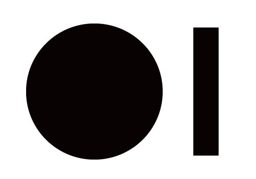
Now that you have a reference for the weight, select the Rectangle Tool and create a rectangle of the same width and height of /I (excluding the dot). Now select the Ellipse tool and create a perfect circle (hold down the Shift key as you drag). The circle needs to be a bit bigger than the rectangle, and it should stick out both at the bottom and at the top. This is necessary because one of the basic principles of type design is that rounded shapes appear smaller than rectangles, so you need to compensate for this by making rounded shapes slightly bigger.
Let’s create actual letters. First go to Edit > Preferences > General and change the Keyboard Increment to 2pt. This changes how much a vector point moves if you select it and press one of the arrow keys. You will likely change the Keyboard Increment frequently while designing a typeface, depending on what you use it for. For example, modifying a curve requires a smaller Increment value than when I use it to change the Regular weight into Bold. Keep track of which Increment values you use for what. If for example you make the /I one Increment smaller with a 2pt value and you make the /b one Increment smaller with a 4pt value, your weight between these two letters is obviously not consistent anymore. If at a later stage you feel like you might have ruined some of the consistencies in the proportions (it happens to me too at times), just select one letter as the base letter and compare the other letters to the base letter (by superimposing) and modify accordingly.
Select the Direct Selection Tool (the white arrow) and select the left vector point of the circle and move it a few Increments to the right. Select the right vector point and move it a few Increments to the left. You now have a condensed circle. The reason why you should use this method rather than directly create an oval shape with the Ellipse Tool is because an oval would be thinner at the top and bottom. It works better if the shape is a bit bulkier.
Figure 1
Now copy the oval shape and put it in the exact same spot as the first oval. So, two shapes superimposed on the same spot. Change the color of the top oval to white and select the Scale Tool. Turn Preview on and go for a Uniform percentage of around 65%. Select both ovals and select Minus Front in the Pathfinder panel. If you don’t see the panel, go to Window > Pathfinder. You now cut the white shape out of the black shape, and in effect you have a badly designed /o.
Figure 2
Horizontal strokes
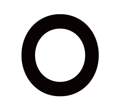
So why would I want you to create a badly designed /o? Well, it’s not an /o just yet. One of the basic principles in type design is that horizontal strokes appear thicker than vertical strokes, so you need to compensate for that. I would usually tell you to select the top inner vector point and move it around 1 Increment up, and select the bottom inner vector point and move it the same amount down, but if you resized the white oval to 65% in the previous step, your /o is thinner than your /i. So instead, select the left inner vector and move it around 2 Increments to the left, and do the opposite to the inner right vector. The letter is still too thin compared to /I, so move the outer left and right vectors around 1 Increment outwards. I say “around” because this is not an exact science. Just modify until it looks right.
Figure 3
I think the /o looks pretty good. Now you have this basic letter you really have to decide which direction you want to take your typeface into. If you move the top and bottom inner vectors outwards, the left and right inner vectors inwards or the left and right outer vectors outwards, you will adjust the contrast of your typeface and it starts to look like a serif typeface. The more you raise the contrast, the more you need to adjust the bézier curves. Do this by selecting the inner top curves with the white arrow and move up. You might want to use a smaller Increment size for this, like 1pt. Do the opposite to the inner bottom curves. You now have something that starts to look like a Transitional typeface like Baskerville. Look at my result in figure 4.
Figure 4
Raise the contrast even more to get a Didone typeface like Didot and Bodoni. If you go back to the shape of figure 3 and move the left and right outer and inner vectors inwards, you condense the letter and when you select the inner and outer curves and move the bézier curves outwards, you make the letter more squared. If you do that, you might end up with something like DIN. Look at figure 5 for my DIN-like /o.
Figure 5
Ahilno
Alright, so that’s some of the basics covered and we designed our first letter. Let’s make more letters. Right now we can still take our typeface into every direction. We can adjust weight, width, style etc. But now we will start defining some things. In order to define our style and proportions, we will design a/h/i/l/n/o. Ahilno!
So why these letters? Well, the /o I don’t usually design first, but it was handy to design it first for the sake of this tutorial as it covers a few basic principles in type design. A letter like /n is technically more advanced. I first design the /I to get the weight and x-height (the height of the lowercase letters without ascenders or descenders). I then use the /I and make it taller to get the /l. The height of the /l defines the ascender height, which is a bit higher than the capital height. I then design the /n before I combine /l and /n to get /h. A lot of letters can be designed by using elements from other letters. You can design a one-storey /a (like in Futura) by using /I and /o and do some modifications. For a two-storey /a (like in most typefaces except for geometric sans typefaces like Futura), there isn’t really a letter you can reuse except the /I to get the stem of the /a. The /a is a very common letter in languages, and so a two-storey /a helps define the style of your typeface. Because it’s such a common letter you might want to spend some extra time on it and give it character. Don’t do anything wacky though, because this can be very obtrusive. Also, consistency is key, so if you give the /a a sharp serif, I expect the other letters to feature sharp serifs as well.
So, the letters in “ahiln” I design first because they define the style and dimensions. The letter /o might actually be a useful letter to design in the beginning because it defines a secondary width. Remember how rounded letters need to be bigger to look optically the same size as letters with a straight top? Well, that also counts for the width. Your /o will be slightly wider than your /n, and other rounded letters like b/d/p/q will likely resemble the width of /o. Don’t look too much at the general width of the letters though; the negative space is actually more important in this case. If the negative space inside /o equals /n, you know you’ve chosen a proper width for a consistent rhythm.
With the letters of “ahilno” you define everything except for the descender height, capital height and diacritic (éèêë etc.) height. I usually define these at a later stage. In fact, in most cases I won’t start designing the capital letters until I have at least half of the lowercase letters done. It’s much easier to define the style of your typeface with lowercase letters anyway.
The descender height should resemble the ascender height (but it can be slightly shorter than the ascenders), the capital height should be underneath ascender height and you will have to judge for yourself how high to position diacritics. Don’t get too caught up in defining all these heights though. I usually adjust these values at least 10 times during the design process of my typefaces. Same goes for the x-height, width and in some cases even the weight. You can adjust all the ascenders at once, but if you change the weight you will have to modify each letter individually—which is quite some work, so the weight and x-height are better defined at the beginning and not changed later.
Making oli
That’s enough background information for now. Let’s make some other letters. Select the rectangle you made at the beginning of this tutorial. Make a copy, because you will be using this rectangle frequently. Now that you roughly have the width defined with /o it’s easier to guess roughly how high your ascenders will be. As I mentioned before though, this isn’t an exact science and the ascender height will likely be subject to change. But for now, let’s extend the rectangle to make the letter /l. Now copy the first rectangle again. Select the Ellipse Tool and make a perfect circle which is slightly wider than the rectangle. Resize the circle to match the weight of the rectangle (not the width!). Center the tittle (that’s what the dot on /I and /j is called) horizontally on the rectangle, and position the tittle vertically somewhere between the lowercase- and ascender height. Now, it’s important to note that tittles and dots look like perfect circles, but they rarely are. The shape of these characters depend on the style of the typeface. A serif typeface could feature quite an unusual shape. Have a look at figure 6 for two examples (left: Swift / right: Brioso Pro).
Figure 6
For a sans serif typeface the shape of the tittles and dots will be a lot more conservative—particularly in case of a geometric typeface. Go to Edit > Preferences > General and define a Keyboard Increment of 0.5pt. Now select the top and bottom left horizontal bézier curves and move one increment to the left. Do the opposite to the right side. Now you should have a slightly more bulky looking circle for the tittle. If you want the stem and tittle to stay together, group them by selecting both shapes and press Ctrl + G (Windows) or Command + G (Mac). If you want to ungroup again, do the same but also press Shift. If you did everything right, you should now have 3 letters which look roughly like my result in figure 7.
Figure 7
Making nhmu
Alright, so thus far we made some of the easiest characters. Well, easy for a sans serif. A serif is a bit more difficult, and particularly the /o can be deceivingly difficult if you have a diagonal stress (weight distribution according to a diagonal axis). Have a look at figure 8 to see the three ways of distributing the weight.
Figure 8
Now make two copies of the first rectangle you made and place them by a little distance apart to resemble the negative space in /o (roughly like in figure 9, but adjustments can be made later).
Figure 9
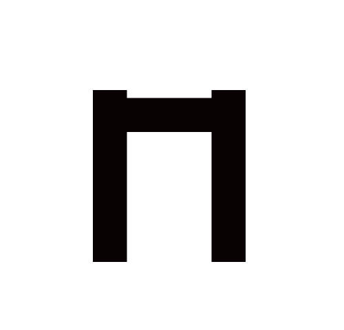
Select one of the rectangles and make another copy. Rotate it 45° so the rectangle is positioned horizontally. Shorten it a little bit and position it between the two vertical rectangles near the top, like in figure 10. Select all three shapes and click on Unite in the Pathfinder panel.
Figure 10
I now came to a point where it’s rather complicated to explain what to do, so I will offer you a figure with multiple steps so you can create your letter /n. But first, let’s add a few guidelines. Create a new layer and call it “guidelines”. Press Ctrl + R (Windows) or Command + R (Mac) to show the rulers on the top and left of the canvas and drag guidelines from the ruler to the top and bottom of your first rectangle, and do the same to the top and bottom of your /o and the top of your /l. Lock the guidelines layer so you don’t accidentally move any of the guidelines. You should now have something like in figure 11.
Figure 11
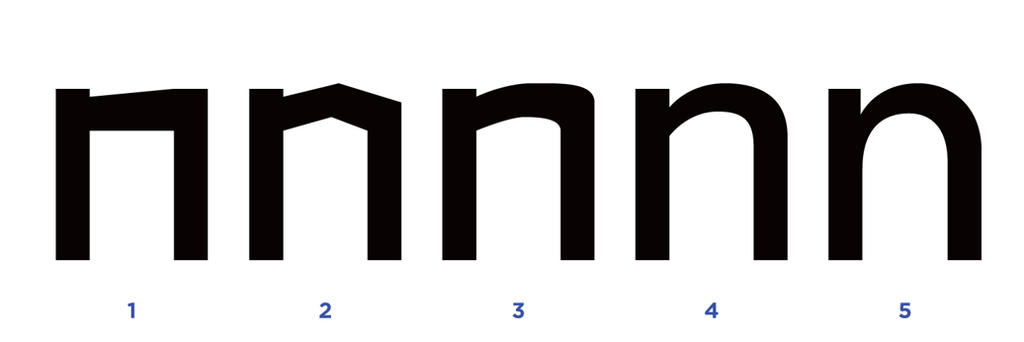
Now let’s go through a few steps to finish the /n. Look at figure 12 while following these steps.
Figure 12
- Select the shape with the two verticals and one horizontal stroke. Counting from the right and the top, remove the second vector point to get a shape like in 12.1.
- Move the most right vector point down, move the second vector point from the right a bit to the left and align it with the overshoot guideline (the one which aligns to /o). Add a vector point to the bottom part of the horizontal stroke and move it up. You know have a shape resembling an /n made without curves.
- Select the Convert Anchor Point Tool (one of the options in the Pen Tool panel) and drag each vector point while holding Shift to create horizontal bézier curves. Do this only to the 4 most right vector points. You now have something similar to 12.3.
- Now move the two most right vectors down and increase the length of the bézier curves. Move the vector on the inner horizontal up. Move the two vector points touching the stem (the left vertical stroke) down; the upper one more so than the bottom one. These two vector points will define at what position the arc starts, and the top vector of the two defines the contrast. The curved stroke is called a “shoulder”; I will refer to it as such from now on. Increase the length of the left bézier curve of the arc. You now have a letter /n, though it’s anything but refined.
- Move the top right vector of the stem a bit to the left. Select the Convert Anchor Point Tool and define the angle of the top vector near the stem (at the beginning of the shoulder). Click on the left anchor of the bézier curve to remove that side. Do the same to the bottom vector at the start of the shoulder, but removing the left anchor is optional. If you remove it, you will have an abrupt angle between the stem and the shoulder. If you don’t remove it and align the anchors vertically, you will have a smooth transition between the stem and the shoulder. Refine the other vector points and bézier curves. There is no exact method here, so just have a look at the outlines of other typefaces. Do keep the contrast and style consistent with your other letters though. A final thing worth noting is that the weight in the shoulder is usually distributed more to the right to give some space in the area between the top of the stem and the shoulder. Oh, and this has nothing to do with the letter /n in particular, but remember to NEVER let an anchor extend beyond another anchor. Look at figure 13 to see what I mean.
Figure 13
Now that you’ve designed /n, it’s easy to make /h. Simply copy /l, superimpose it on the stem of /n and Unite it with pathfinder. You can also design the /m using /n, though this is a bit trickier. First, copy /n. Now, select the right vertical (all four vector points) and move it about 4pt to the left. Now also include the two vector points in the middle of the letter and move the whole right side about 4pt to the left. Shorten the anchors in the arc by about 1pt on both sides. Adjust the top of the shoulder, and you’ve got a more narrow /n. Copy the narrow /n and remove the stem. Attach the /n without a stem to the right side of the narrow /n and Unite with Pathfinder. Fill the gap at the top center of the proto-m and refine the curves to match /n and /h. You now have a proper /m.
Now let’s make another easy letter. Copy /n and rotate it 90° to get a /u. Move the letter down until the arc aligns to the bottom overshoot, the bottom of the stem aligns with the baseline and the top of the stem aligns with the lowercase line. As you might notice though, /u looks optically wider than /n. Simply compensate for this by narrowing the letter by about 1pt on each side of the vector in the middle (the same way as we did with /n when we were designing /m) and reduce the anchors by about 0.5pt on both sides. You should now have something like in figure 14.
Figure 14
Making a…
So we created a few extra characters, but we have our basic “ahilno” except for the /a. This is the most advanced letter yet. Well, the two-storey /a is, anyway. For a geometric sans typeface like Futura it may be preferable to design a one-story /a. I will show you how to design both of them.
- Let’s design the one-story /a first. Copy the basic rectangle and copy your /o. Select the most right vector and move it inwards about 12pt. Select the right inner vector and move it to the right about 4pt. Increase the vertical anchors on the inner right by 2pt each. Now select the Rectangle Tool and create a rectangle about half the size of your basic rectangle. Superimpose them and select Minus Front in the Pathfinder panel. You will now have something similar to figure 15.1.
- Superimpose the distorted /o with the rectangle shape. I cut a shape out of the rectangle so that I can bring the rectangle closer to the counter of /o without covering part of the counter with a straight vertical shape. Bring the two shapes close enough so that it looks like the counter takes a little bit out of the stem. Now Unite the two shapes with Pathfinder. You should have something similar to figure 15.2.
- Move the bottom and top vectors in the middle of the bowl about 2pt to the left. Move the top vector where the bowl connects with the stem about 12pt down. Do the opposite to the bottom vector. Now adjust the bézier curves so the bowl smoothly slopes inwards towards the stem. Check if the indent at the bottom roughly matches the one in /u; the indent shouldn’t be much higher or lower. Move the whole stem about 2pt to the right. After refining and adjusting the weight distribution and width a little bit, you should have something similar to /a in figure 15.3.
Figure 15
Now that the one-story /a is done, you can easily design /d. Copy /a and /l and superimpose /l with the stem of /a and Unite the shapes with Pathfinder, just like we did with /n and /l to create /h. Don’t forget to cut out a part of the /l before you merge it with /a though (like we did with the stem of /a), otherwise it will cover part of the counter. After merging the two shapes, don’t forget to remove any unnecessary vector you might discover in the stem. These extra vectors sometimes appear when merging shapes if they didn’t align to the micrometer exactly—which they usually don’t. Now your /d is finished, copy and reflect it to make a /b. It’s very important to note here that just like /n compared to /u, a rotated or reflected letter still needs adjustments before it becomes an optimally designed letter. For example, I might move the top serif of the bowl 2pt to the right and increase the length of the top right anchor of the bowl.
Figure 16
Let’s design the two-story /a now. Some typefaces feature both versions of the /a so you can choose. It’s not always the best option to give the end user the choice between different characters, but you might be able to judge this best. Sometimes in type design it’s not so much what the end user would like, but how you intended the typeface to be.
- Copy your one-story /a. Remove the two vectors which form the indent at the top. Select the Rectangle Tool and create a horizontal stroke roughly the same weight as the letters. Superimpose it on the left side of the bowl and click on Minus Front in the Pathfinder panel. You now have something like figure 17.1.
- Create another horizontal stroke and superimpose it on the top of the bottom part of the bowl and the stem, so you essentially create a new bowl. Merge the shapes and remove the unnecessary vector point . You should now have something similar to figure 17.2
- Add an extra vector to the inner top of the bowl and move the other vector points around to achieve something similar to figure 17.3.
- Use the Convert Anchor Point Tool while holding Shift to add curves and move the vector points around some more. You now have a basic shape for /a which you can start refining. Look at figure 17.4 for my flawed design.
- For a geometric sans typeface you might want to keep the bowl and stem minimalist. For a grotesque or humanist sans typeface you can play with the contrast of the bowl, the weight distribution, the slope of the curve towards the stem and you can even add a spur to the bottom of the stem. Look at figure 17.5 for the result of my geometric /a, and at figure 17.6 for my humanist /a. 17.6 is definitely not fitting for a Futura-like typeface, but just to show some of the possibilities.
Figure 17
A final character
So we have “ahilno” completely covered now, and in the process we went through the basic type principles. You now probably know enough to design the other characters as well. If you get stuck, just reference other typefaces. You learn a lot from inspecting professional designs.
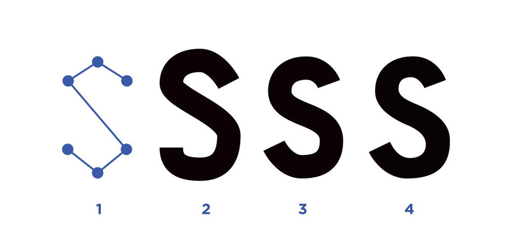
There are many more principles to consider when designing a professional typeface, but for now this should be enough to get you going. Before I end this article, let me show you how to design the letter /s, as it seems this is the character most beginners have trouble with. There are several ways to design this letter, but whichever approach you use, it really doesn’t matter as long as you consider the basic principles of type design and refine the result. You can first draw the letter with the Pencil Tool and Expand the outlines and then refine it, you can connect two C-shapes and remove the kinks from the center where the two shapes connect and refine the rest, or you can use the method I’ve been using in this article. Because of the amount of curves in the letter /s I actually wouldn’t recommend using the method I’ve been using so far.
- For this letter I will use the Pen Tool with a Stroke. To match the weight of the other letters, select a pt size of 38 for the stroke. Now click and place 6 vector points at each extreme end of the shape of the letter /s. Look at figure 18.1 to see where to place the vector points. Either make every anchor curves while you place the vectors, or first place the vectors and then add curves with the Convert Anchor Point Tool. After adding curves you should have a flawed looking /s such as in figure 18.2.
- If you want the middle part of the spine of /s to remain straight, add another vector in the center and extend the anchor points. Now move the top and bottom vectors so that the stroke perfectly aligns with the overshoot guidelines. Move the other strokes around until you’re happy with the basic construction of the /s. See my result in figure 18.3.
- Expand the strokes so they become outlines. Make sure the horizontal strokes are thinner than the vertical strokes, and further refine the character. You should end up with something like figure 18.4.
Figure 18
And here are all the characters of our geometric typeface together:
Figure 19
Future articles
So that’s it for now. I was going to show how to design serifs as well, but this article would become way too long if I have to cover that now as well—particularly since I would have to introduce a few new principles, and I’m sure from there I would want to expand to the next. So let’s do this one style at a time. Future articles will be about:
• Designing a serif typeface
• How to easily add Oblique to your sans typeface and how to add Italics
• How to expand your typeface with bolder or lighter weights
• How to add full language support to your typeface
If you want to know how to design capital letters, I will consider writing an article/tutorial covering that as well, though in general they’re easier to do than lowercase letters so if you know the basic type principles you should be able to manage. Also let me know if you have any suggestions for future articles.
