How to design a typeface (Part 3)
Serif — Roman
In the last two article of the type design series we made a geometric sans serif and added italics and a bold weight. The geometric sans serif is the easiest style to do, but for me personally things really get interesting with serif typefaces. Of course there is the addition of serifs, but the structure and weight distribution is also much more advanced. In this article I will make an introduction to designing serif typefaces. This article won’t be as detailed as the previous ones because this third article serves as an expansion on the first two. In other words, I won’t get into the basic vector tools or type principles, nor will I show you how to design the letters step by step. I will explain techniques in detail when necessary, but generally I will refer to the techniques described in the first article particularly. So if necessary go back to the previous two articles of the series.
The first letter
With a sans serif typeface I generally start with a lowercase letter like /I to define the x-height. With serif typefaces I first want to establish the style of the serifs before I define the x-height. So, usually I will start with a capital /I. I start with a vertical stroke of the same weight as a Regular typeface. I convert the stroke to outlines and then add two horizontal rectangles and position them at the bottom and top of the vertical stroke. Now merge the three shapes with Pathfinder and remove any unnecessary vector points which may show up at the very top and bottom after you merge the shapes.
Figure 1
Now you have a very basic serif capital /I, and this is where the fun starts. You might be aware that there are quite some different serif styles. Before we continue working on our serif typeface, let’s have a look at a few different styles.
Type categories
In figure 2 are the main serif categories exclusive the slab serif. I suppose you could call these the classical type classes. The 4 classes go from old to new: Venetian/Humanist (Jenson), Garalde (Caslon, Garamond), Transitional (Baskerville) and Didone/Modernist (Didot, Bodoni). If you look at the weight distribution and the details of the serifs you will notice there is a gradual transition from calligraphic to mechanical. This transition is parallel to the development of improved printing techniques and refined letter casting and designing processes. If you’re curious about the history of Roman typefaces (meaning typefaces in the Latin alphabet), read my appropriately titled article "History of Roman typefaces". If you want to design a serif typeface it’s tremendously beneficial if not required to know how serif typefaces developed and which aspects define their style. It’s very hard to make the letters consistent in design/style if you don’t really know what style you want to design or what characteristics are common for that style. For example, it wouldn’t be wrong to design a humanist serif typeface with the weight distributed vertically, but since the weight distribution is historically diagonal in humanist serif typefaces and it’s vertical in transitional serif typefaces, you couldn’t consider your hypothetical design historically human. Most contemporary serif typefaces are hybrids of different styles though, so it’s not wrong to mix. I just want to alert you to the fact that some knowledge of the different styles and their historical context will make it much easier to make specific decisions for each letter and to create a consistent whole. That’s where the real challenge is. It’s one thing to design a beautiful letter, but it can be difficult at times to translate the same style to a different letter and keeping the weight distribution and general weight consistent throughout the typeface. And then there is another challenge: to design italics to fit the roman.
Figure 2
Serif styles
Before we will go back to the design I want to show you some different types of serifs. I think by now you’ve already decided what kind of serif typeface you want to design, but let me give you a few tips and show you different types of serifs—the serif types and serif classifications don’t necessarily need to match, and it may bring interesting results to mix a few styles. I’ve tried quite a few things out myself, and sometimes you get a lucky accident. Other times I have a good idea in my head but once the idea is executed it’s not quite as great as I thought it would be, or I just haven’t figured a proper way to execute the idea. You tend to go a lot by trial and error, and as you get more experienced things will become more intuitive, but I suppose there’s always the chance to get into a boring routine, so it’s good to mix it up once in a while.
Figure 3
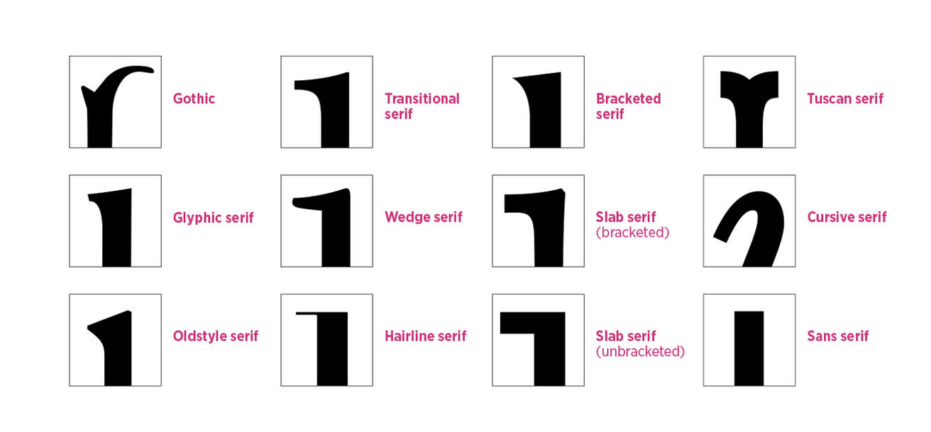
In figure 3 are some different serif styles, but probably not even all of them.
- Blackletter typefaces have all kinds of different “serif” shapes, but they always resemble a rhombus because the gothic script is calligraphic.
- Glyphic serifs are usually triangular in shape and very subtle. These serifs resemble the chiseled Roman lettering. There aren’t many glyphic typefaces around, but a good example of one would be Astoria. You will likely find glyphic typefaces under the name ‘semi-serif’.
- You can recognize oldstyle serifs by their triangular shape and a gradual slope.
- Transitional serifs are usually more pronounced.
- Wedge serifs come from the stem at a sharp angle at the bottom rather than a gradual curve.
- The hairline serif is of course unmistakable. This serif can be seen in the Didone types (Didot and Bodoni), but the Scotch types feature the same kind of serif but with reduced contrast.
- Bracketed serifs feature sharp serifs with a gradual curve towards the stem. There is some common ground between bracketed serifs and glyphic serifs as well.
- The bracketed slab serif is not seen that often among slab serif typefaces, but the ones around are often quite beautiful; they combine the elegant look of the classical styles (Garalde and Transitional mostly) with the strength of a slab serif. The result is often refreshing and what we would consider “modern”. Clarendon typefaces also belong to the bracketed slab serif typefaces.
- The unbracketed slab serif is the more conventional style. Also called Egyptian, these typefaces emerged in the early 19th century and combine the legibility of the classical serif with a more rigid construction to create a crisp type with a lot of impact.
- The Tuscan serif can probably be divided into several sub-classes. There don’t seem to be any clear rules regarding the design of the Tuscan serif, but they all have extravagance in common. The most common type of Tuscan type is the typical Western lettering with the overly big slab serifs, but the serifs can also be highly decorative. It’s common for Tuscan serif typefaces to feature decorations at both sides of the center of the stems.
- Today we combine roman and italic (which has a cursive construction) like they’re the same typeface, but the cursive type started out as a distinct style. So initially it wasn’t only used for emphasis but whole texts were set in a cursive type. Although we don’t recognize it as a distinct type category any longer, we have to acknowledge that the cursive serifs are very distinct and deserve their own class. The cursive serif can take on all kinds of shapes, partially depending on the shape of the serifs of the roman, but cursive serifs are always either curved or diagonal to resemble cursive writing, which is the root of this kind of type style.
- The sans serif is without a doubt the easiest style to recognize, simply because it’s the absence of serifs.
In figure 4 you can see a few samples of a wide spectrum of possibilities for the serifs. For those who are interested about the designers:
- Mercury was designed by Jonathan Hoefler and Tobias Frere-Jones / 1997.
- Collis was designed by Christoph Noordzij / 1993.
- Jannon was designed by Jean Jannon in 1621 and digitized by František Štorm / 2001.
- Alegreya was designed by Juan Pablo del Peral / 2012.
- Aghari is my own design. It’s still in development, so the design may still change slightly. On that note, any feedback is welcome.
Figure 4
Serif letters
So I think we have some background information and inspiration for our own serif typeface now. Of course one should still consider the application of the typeface. If you will use it for newspapers, one of the requirements will be that the typeface should be relatively condensed to allow for more text in a given space, especially for the typeface used for headings. A book typeface needs to be legible and shouldn’t tire the eye so quickly (which geometrical typefaces, high contrast typefaces and typefaces with a focus on the vertical strokes end to do). So these are things you will have to consider, but during the design process a lot of changes can still be made. As I explained in the first article though, you will save yourself a lot of time if you do establish the x-height so you won’t have to change it later. Other than that, I think you know what kind of typeface you want to create, so let’s first focus on the design of the serifs of the first letters, and then worry more about the general construction of the typeface. Mind you, I do recommend you sketch out some ideas on paper. Most of my process is digital and I’m embarrassingly bad at drawing letters on paper (for a type designer that is), but more than once I did get some great ideas out of just doodling letters—often pages full of the same letter, just to get an idea of all the variations and possibilities.
Creating space for your letters
Thus far we have a very minimalist capital /I. Now it’s time to mold this shape into something more exciting. I won’t do this step by step; the basic principles are described in the first article and showing you where to place what vector point at this point of the type design article series will limit your potential to create something unique. The reason I have more fun designing serif typefaces than sans serif typefaces is because there is more variation and more potential to design something unique, because you can bring originality in the serifs and you can play around with the weight distribution. The latter you can also do with sans serif typefaces, but usually a lot more subtly.
What I can tell you however is that usually the two vector points at the base (the corner between the serif and the stem of the letter) are moved up so you can add a bézier curve. Don’t be afraid to add vector points where necessary. For example, my Aghari typeface features vector points at the center of the stems so I could make the middle a bit more thin, which will give the typeface a more organic look. Also, because by thinning the center I essentially focus the weight at the top and bottom. The fact that the center therefore becomes lighter gives me the opportunity to compensate for that weight by making elements in the central region more prominent. For example, by moving weight out of the center, in the center I suddenly have a cleaner canvas as it were to do something special with the way the strokes connect in the letter /k, or do something special with the bowl of /a etc. You have to play around with the black and white space to create something balanced and interesting. I can’t tell you how to do that, other than to practice and look at the details of other typefaces. If you have the typeface on your computer, convert the letter to outlines and inspect the use of vectors and bézier curves.
Symmetry
I hope by looking at other typefaces you will manage to design proper looking serifs for the capital /I. As you can see in a typeface like Didot though, serifs don’t need to be very complicated. Also, most serif typefaces feature symmetrical stems, but depending on the style of typeface and its application, it may be interesting to create something more dynamic. As you can see in figure 4, the stems are symmetrical in Mercury, Collis and Jannon, and this fits the general design perfectly. In Alegreya you see the designer played around with the shapes to create tension and a sense of direction. The result is a vibrant, dynamic typeface. In terms of design this makes things a lot more interesting, but with typefaces you need to consider both design and function. Mercury was designed for newspapers, and this printing environment (the inks, paper and machinery used to produce newspapers) won’t do a highly dynamic typeface much justice. Ink may be absorbed in places where it wasn’t meant to be, and this may distort an already vibrant and perhaps even unruly design. That is not to say all newspapers should look boring (quite the contrary, in fact), but these are limitations which should be considered. For starters a typeface for a newspaper will likely have flat serifs to bring some order to the baselines. In my Aghari typeface you can see I also subtly played around with asymmetry. Not so much to create a lot of tension, but just enough to keep it interesting. Most of my serif typefaces are designed with editorial use in mind, so they’re usually quite legible, feature a medium to relatively high x-height and take a lot of inspiration from Renaissance typography when it comes to the weight distribution and relative proportions between letters.
Figure 5
From capital to lowercase
Alright, so I always start with the design of the capital /I to get the stems and serifs the way I want. From there I can easily expand the typeface. Two /I’s with a horizontal bar and you can design /H, cut off the bottom of /I and replace it with a tail and you get /J and use the /I for the stem of B/D/E/F/K/L/M/P/R/T/U/Y. Before you do all that work though, it’s better to first focus on the lowercase letters. As the fact that you can create so many capital letters by using the /I shows, there is less variation in capital letters. I mean, you can still vary a lot, but capitals will always look blocky. It’s with the lowercase letters that you can really define the style. Firstly because the letters vary more, but also because you can play around with the ascender and descender lengths and the x-height. The first step though is to design the top serif (figure 6). To do that, we first take the /I and cut off the top half. You then replace the top with a top serif, as seen in the lowercase /i. I advise to get the shape of this top serif perfect because it’s one of the most prominent elements in a serif typeface. It’s also fairly easy to design something original for the top serif. You can design anything resembling something from the shape of a triangle (Mercury, Garamond) to the shape of a rectangle (Museo Slab, RePublic), but I don’t even see why you couldn’t try a circular top serif. Just play around with it. Also keep in mind though that the shape of this top serif will be one of the elements which creates the texture and it can shift weight. For example, the top serif of Jannon is very sharp at the top, so this will create tension in the x-height and provide a sharper texture. By contrast, Garamond also has triangular top serifs, but they’re a lot softer and subtle. The top serif in Mercury is rather small, which resembles the weight of the regular serifs. By contrast, in my design of Aghari the weight is shifted away from the middle of the stems and it’s largely focused in the base and the top serifs, so while in Mercury the stem is dominant, in Aghari the top serif and base are dominant. So, always keep in mind what each design decision will do for the texture, weight distribution and general appearance.
Figure 6
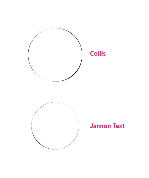
For the tittle (the dot) of /I (and /j), be reminded that it should never be a perfect circle. The tittles in Collis and Jannon are almost circular, but if you superimpose a circle on the tittle and zoom in close enough you will see that the tittles are in fact not perfect circles. I attempted to show this in figure 6. Here I zoomed in on both tittles to show they subtly differ from a circular shape. In case of Collis the tittle is white. In case of Jannon Text I had to color the tittle black and color the perfect circle white, because due to the shape of the tittle if I were to do it the other way around, the circle would completely cover up the tittle of Jannon Text. The difference in presentation between the two tittles aside, you can clearly see that both tittles are in fact not perfect circles.
Figure 7
More lowercase letters
Once you have the capital /I and lowercase /i, things become easier for a little while because you can create lowercase letters in a similar way to the process of a sans serif. First you copy /I (excluding the tittle) and extend the length to ascender height to create the /l. Copy the /I again to use as a stem for /n (instead of using rectangles when we designed the sans serif /n in the first article) and follow the process of the first article to create the whole letter, but obviously with a higher contrast between thick and thin. Look at figure 8 to see a quick way to create /n.
Figure 8
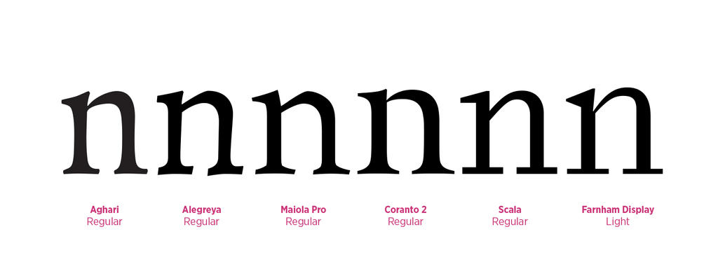
You can vary more with the point where the arc emerged from the stem, how thin it starts from the stem, and where the weight is distributed along the arc. In figure 9 are a few distinct styles. Click on the picture to see a larger version so you can inspect the details. Note the different ways of distributing the weight, the different use of angles and how the base serifs tend to show some variation within each letter.
Figure 9
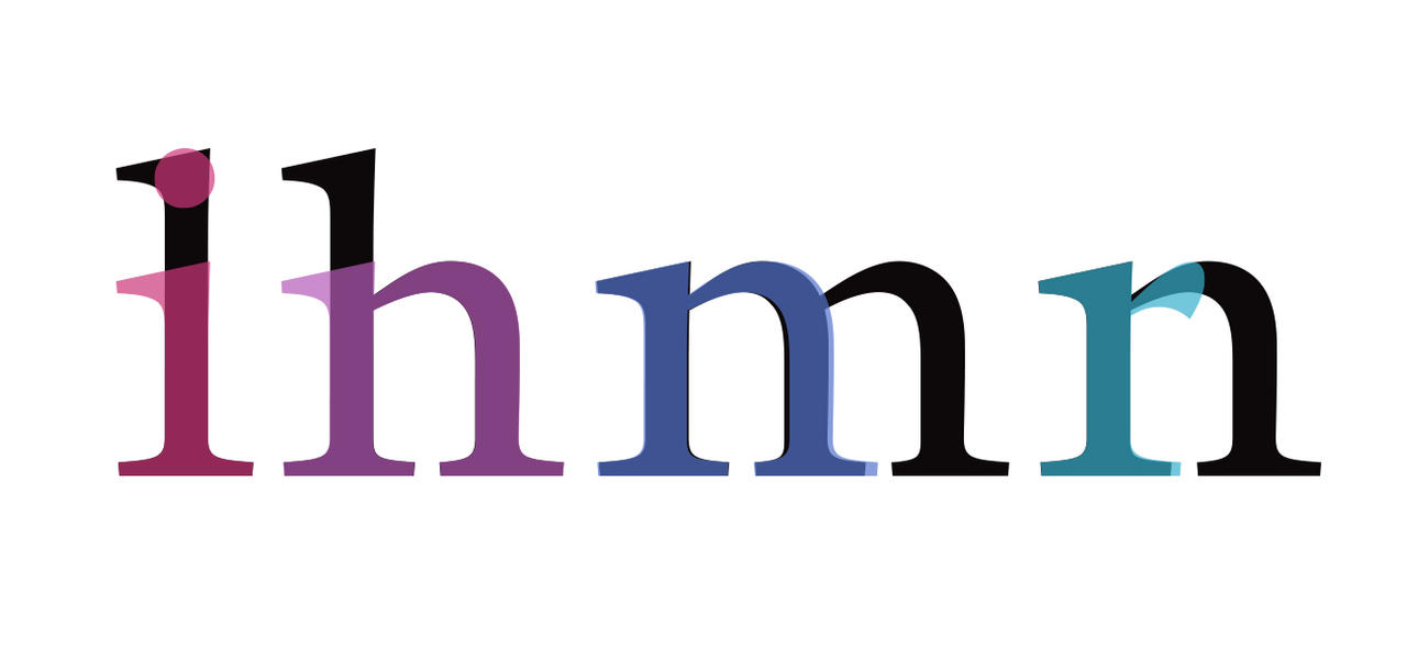
Once you have the letter /n, you can follow the process described in the first article to create /h (by using /l), /m, /r and /u. In case of /m, you may want to decrease the middle base serif a bit to increase the aperture (aperture= how open the letter is). In case of /r I would slightly increase the length of the right base serif to compensate for the empty space underneath the arm. Also look at the /r in other serif typefaces for inspiration, because there is quite a lot you can do with the arm of /r.
Figure 10
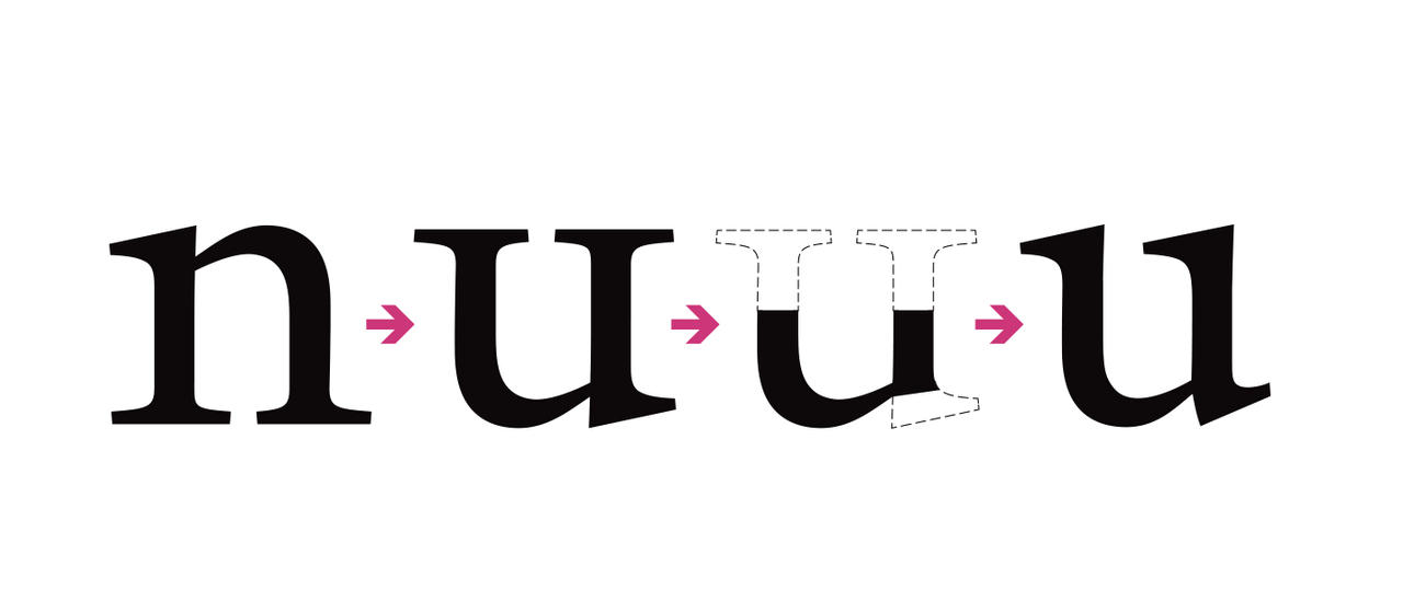
As for /u, be reminded that you have to condense the letter a bit because a /u always looks optically wider than /n so you need to compensate for that. If you just flip the /n upside down though, you might discover the result is not quite as pleasing as it was in case of the sans serif. This is because the base serifs of /n now become the top serifs of /u, and the top serif of /n becomes the spur of /u. So after flipping the letter /n, cut off the top part and replace it with the top serif of /i. Now remove the bottom serif of /u and replace it with a spur. You have some opportunity here though. In some typefaces this spur somewhat resembles the shape of the top serif (the same as the spur of /d), while in others the spur is a curved shape as can often be seen in the lowercase /a. The former is much more common, but this it’s an area where you can make your typeface more distinct—if it fits the design of your typeface that is.
You might also want to increase the length of the right top serif a bit, and it probably looks best if you make the curve at the bottom a bit more squared compared to the /n. I don’t know why, but this ends up looking better every time I do it. I suppose it’s one of those optical illusions again, such as the /n looking optically wider than /n. A very good tip is also to adjust the letter according to the eye and not according to strict rules. Initially you need rules to keep your typeface consistent, but after that comes a process of fine-tuning according to the eye. So don’t be afraid to move the connection point between the stem and the arc up a bit in /u compared to /n, as long as it looks good. The design process of a serif typeface tends to be a lot more like molding. A lot more manual work is involved, and a lot more fun with the weight distribution. In figure 11 you can see the process of how to go from /n to /u. Do note the alignment to the guidelines. So far the top of the lowercase letters were either rounded or sharp so they aligned to the same guideline. Now we turned the /n upside down and suddenly we flat, rounded and sharp objects, and so we need an extra guideline; one for the flat objects, and one for anything which looks optically smaller (rounded and sharp objects) so the objects can extend a bit beyond the baseline and x-height when necessary. This might sound confusing, so just have a look at the guidelines of the typeface provided at the end of this article.
Black and white
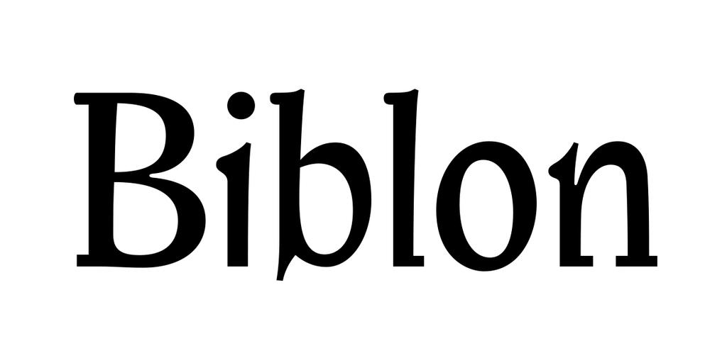
I’m going on about optical adjustments, molding and weight distribution, but something occurred to me. If you want to create a typeface with an even color (meaning the black weight is optimally distributed), you can think of a white field with a black blob on it. Depending on the way the black blob interacts with the white, you can shape letters. A wider letter (like /m or /w) requires a wider field while a small letter (like /l or /i) requires a smaller field, and the black blob shrinks or grows relative to the area of the field. As such a mathematical system could be constructed to calculate the optimal size of the black blob per letter given a certain weight, because obviously a bold font will have more black space than a light font. If such a mathematical system is constructed, you could also see how much each letter of a given typeface deviates from the optimal amount of black relative to white. This should give interesting statistics, but it should be said that an even color is not necessarily what you want. Didone typefaces like Didot and Bodoni for example don’t have an even color at all; most of the weight is in the stems, and so there is a focus on the vertical strokes while horizontal and many diagonal strokes are very thin or in some typefaces remain completely absent, since the thick strokes alone are enough to recognize most letters. I personally think typefaces with a very even color tend to be dull. If you vary a lot with where you focus the weight though, you will get something wacky and quite hard to read. An excellent example of this is ITC Biblon. Love it or hate it, but it can give some very interesting results. One should just be reminded of the application of the typeface. ITC Biblon works excellent at display size, but at text size the texture resembles that of a blackletter, or something handwritten; so if you want crisp and modern, ITC Biblon is definitely not a good text typeface. If you want something playful and quite dark in color then ITC Biblon might be a good choice. It’s one of those typefaces with such a distinct character it might be difficult to find a project for it though. But then, you don’t select the projects for the typefaces but the typefaces for the project. There are plenty of typefaces I would love to use but just haven’t gotten a project which it would be perfect for yet.
The letter ‘a’
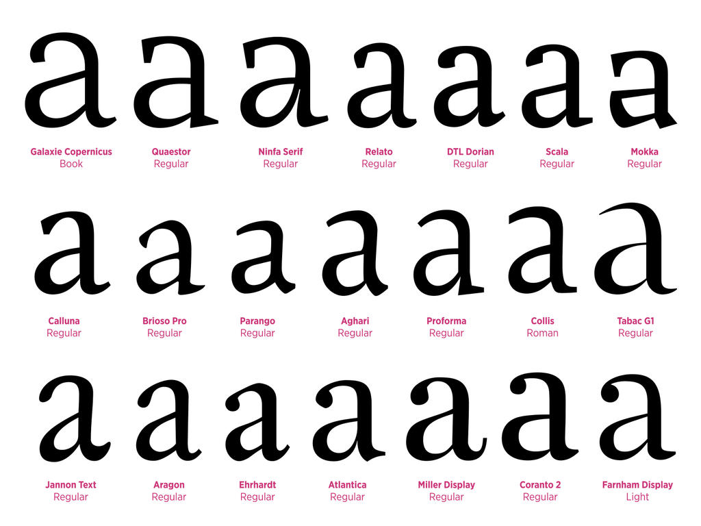
In a previous article I talked about the importance of the letter /a; how it’s one of the most prominent letters and one of the most commonly used letters and is therefore a great letter to show all you’ve got and really make your typeface distinct. In the English language the most commonly used letters are /e (12.7%), /t (9.1%) and /a (8.2%). In all other Western languages the /e and /a are also among the most commonly used letters, and in Spanish it’s even the most commonly used letter. So really, spend extra time on these letters to make them perfect. In case you’re interested in the statistics of the frequency in which other letters are used in Western languages, go to this page. Not only is the /a a frequently used letter, but it’s also quite a challenging letter to design. Full of possibilities, but also challenging. All I can say here is to follow the previous two articles and have a look at the /a in other typefaces. Make sure the proportions are consistent with the other letters, meaning the white space inside /a is roughly equal to the white space in /n. The letter /n is probably a good letter to keep as a master for the width, so you compare every other letter to /n. Some variation in proportions may be wanted though. Particularly Venetian and Garalde typefaces tend to feature more variety in the widths of letters; often such a typeface will feature a condensed /B and /L, wide rounded letters (D/C/G/O/Q) and a wide /M and /N. In slab serif typefaces you will probably find the least variety in proportions among the serif typefaces—monospaced typefaces excluded of course. In figure 13 I selected a range of different /a’s. I wish I could add another 2 rows but that’s really pushing it. Besides, you will find plenty of good typefaces on myfonts.com or on one of the major font foundries like Darden Studio, Emigre, exljbris Font Foundry, FontFont, Hoefler & Frere-Jones, HvD Fonts, Process Type Foundry, Storm Type Foundry, Suitcase Type Foundry, The Enschede Font Foundry, Typejockeys, Typotheque, Underwear, Village etc.
Bee dee pee quu
The letters b/d/p/q are quite strange in the sense that the letters are reflections from each other at first glance. What makes the letters distinct from each other is the weight distribution. Typefaces have roots in calligraphy, so if you were to visualize writing with a calligraphy pen, I think you can imagine where the stroke will become thick or thin. The weight needs to be distributed according to this principle. If you don’t do this, your letter will look awkward. At the right in figure 14 is the /b reflected. As you can see it obviously resembles a /d, but while the weight distribution and general shape of the bowl worked for /b, once you reflect the letter it becomes very awkward. This is because the weight distribution no longer follows the calligraphic flow typefaces are based on.
The letter ‘e’
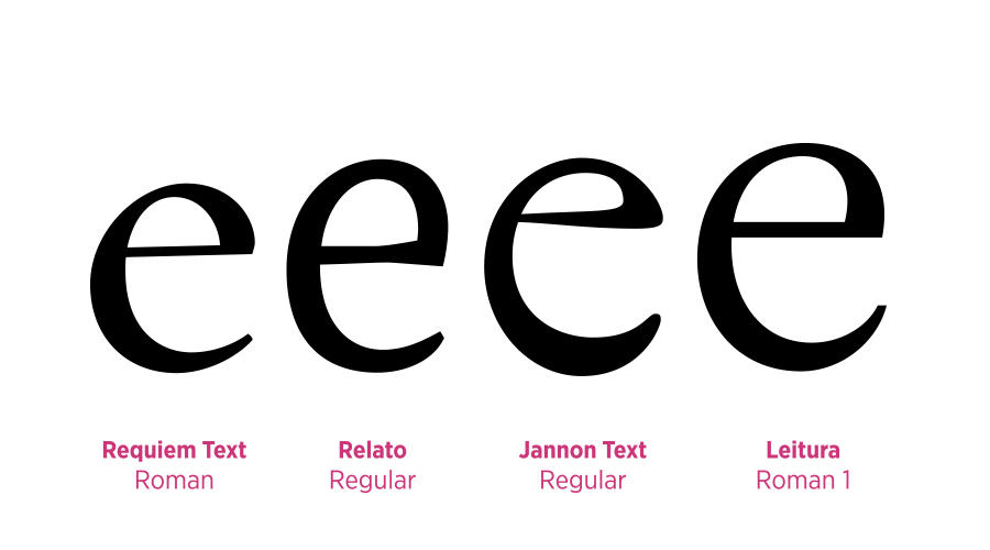
The letter /e is also a common letter, and a prominent one. There are quite some typefaces where the /e has some quirk to make the typeface more distinct. It’s also fairly common to create some tension in the /e, because its shape lends itself well for that. As you can see in figure 15, Requiem Text focuses its weight in the lower left and top right corners, but the letter is balanced. By contrast, Relato’s weight is distributed vertically; most on the whole left side, and a bit on the top right. A vertical weight distribution tends to create less tension, but if you look at the shape of the eye, the letter wants to move to the right. The letter isn’t static, but has a sense of movement. In Jannon Text the weight is distributed diagonally, and in fact most of the weight is in the bottom left curve; a characteristic of oldstyle typefaces. Despite the diagonal weight distribution, the letter features hardly any tension, though a bit of tension was added by letting the horizontal stroke slope inwards towards the eye. The top right is quite flat though, which focuses the letter on its own spot rather than creating a forwards tension. In Leitura the weight distribution is roughly the same as in Requiem Text, but other than Requiem Text, Leitura does have a forward tension. This is created with the shape of the eye, the curve on the top right going a bit to the right instead of immediately to the left, and the terminal (the ending of the curve at the bottom) extends slightly beyond the core of the letter, giving the letter not only a sense of moving forward, but a sense of rotation to the left.
So there are several tricks you can apply to the design of your /e to both make it consistent with the rest of your typeface but to also make it distinct. Also be reminded that although you can play around with the weight distribution within a typeface, it’s going to look really awkward if one letter features a vertical weight distribution (Transitional) and the other features a diagonal weight distribution (Venetian or Garalde). Also, the weight distribution of /c needs to be rather similar to /e. In fact, remove the horizontal bar in /e and replace the top right curve with a proper terminal/serif and you’re well on your way to designing /c. You might want to move the weight very slightly towards the bottom. Remember the example of the black blob and how it interacts with the white space? Well, the black of that horizontal bar of /e has to go somewhere now that you removed it. Removing too much black without adding any back in return will result in a lighter letter. One final thing to remember is that the /e and /c can have a fairly diagonal weight distribution anyway. This doesn’t necessarily indicate the weight distribution of the letter /o, and so the weight distribution in these letters alone are not enough to verify whether a typeface is transitional or oldstyle.
The letter ‘o’
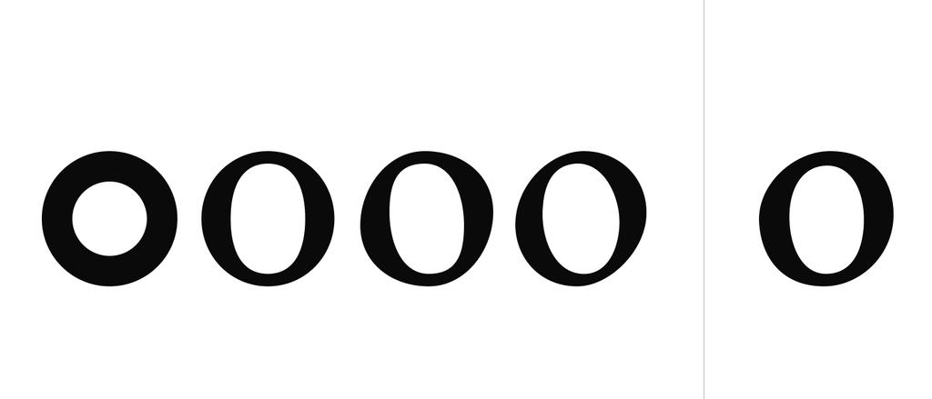
Alright, so they say the letter /g (the double storey one) is the most difficult letter to design and generally I tend to agree with that, and yet with some typefaces (like my Aghari typeface) it seems impossible to design a letter /o which looks good and which fits the typeface. I’m sure it will become easier as I gain more experience and vision, but that doesn’t take away from the fact that the /o can be a deceivingly difficult letter to design. In the first article I showed you how to design the letter /o, and by increasing the contrast I can easily make the letter /o for Baskerville or Bodoni. Any /o with a vertical weight distribution, basically. Once the weight moves diagonally, it can be very challenging to balance it out. One trick is to move the outer left vector down, the outer right vector up, the inner right vector down and the inner left vector up, the top outer vector to the right, the bottom outer vector to the left, and finally the inner bottom vector to the right and the inner top vector to the left. This will essentially rotate the counter (the white space inside the /o) counter-clockwise. Do note that this is very different from simply selecting the inner vectors and rotate the counter with the Rotate Tool, because in that case the bézier curves rotate as well, which ruins a lot of the flow. Move vector points around and change bézier curves to get the result you want, and I can’t say it often enough, but look at other professional typefaces for reference. Especially have a look at the bézier curves if you have access to the vector design. In figure 16 you can see how I went from a simple ring shape to an /o with diagonal weight distribution. Initially the result was the fourth /o. Two things become obvious to me here though:
So I made a second attempt, which you can see at the far right. I’m still not content, but at least it fits the typeface now.
Figure 11
Black and white
I’m going on about optical adjustments, molding and weight distribution, but something occurred to me. If you want to create a typeface with an even color (meaning the black weight is optimally distributed), you can think of a white field with a black blob on it. Depending on the way the black blob interacts with the white, you can shape letters. A wider letter (like /m or /w) requires a wider field while a small letter (like /l or /i) requires a smaller field, and the black blob shrinks or grows relative to the area of the field. As such a mathematical system could be constructed to calculate the optimal size of the black blob per letter given a certain weight, because obviously a bold font will have more black space than a light font. If such a mathematical system is constructed, you could also see how much each letter of a given typeface deviates from the optimal amount of black relative to white. This should give interesting statistics, but it should be said that an even color is not necessarily what you want. Didone typefaces like Didot and Bodoni for example don’t have an even color at all; most of the weight is in the stems, and so there is a focus on the vertical strokes while horizontal and many diagonal strokes are very thin or in some typefaces remain completely absent, since the thick strokes alone are enough to recognize most letters. I personally think typefaces with a very even color tend to be dull. If you vary a lot with where you focus the weight though, you will get something wacky and quite hard to read. An excellent example of this is ITC Biblon. Love it or hate it, but it can give some very interesting results. One should just be reminded of the application of the typeface. ITC Biblon works excellent at display size, but at text size the texture resembles that of a blackletter, or something handwritten; so if you want crisp and modern, ITC Biblon is definitely not a good text typeface. If you want something playful and quite dark in color then ITC Biblon might be a good choice. It’s one of those typefaces with such a distinct character it might be difficult to find a project for it though. But then, you don’t select the projects for the typefaces but the typefaces for the project. There are plenty of typefaces I would love to use but just haven’t gotten a project which it would be perfect for yet.
Figure 12
The letter ‘a’
In a previous article I talked about the importance of the letter /a; how it’s one of the most prominent letters and one of the most commonly used letters and is therefore a great letter to show all you’ve got and really make your typeface distinct. In the English language the most commonly used letters are /e (12.7%), /t (9.1%) and /a (8.2%). In all other Western languages the /e and /a are also among the most commonly used letters, and in Spanish it’s even the most commonly used letter. So really, spend extra time on these letters to make them perfect. In case you’re interested in the statistics of the frequency in which other letters are used in Western languages, go to this page. Not only is the /a a frequently used letter, but it’s also quite a challenging letter to design. Full of possibilities, but also challenging. All I can say here is to follow the previous two articles and have a look at the /a in other typefaces. Make sure the proportions are consistent with the other letters, meaning the white space inside /a is roughly equal to the white space in /n. The letter /n is probably a good letter to keep as a master for the width, so you compare every other letter to /n. Some variation in proportions may be wanted though. Particularly Venetian and Garalde typefaces tend to feature more variety in the widths of letters; often such a typeface will feature a condensed /B and /L, wide rounded letters (D/C/G/O/Q) and a wide /M and /N. In slab serif typefaces you will probably find the least variety in proportions among the serif typefaces—monospaced typefaces excluded of course. In figure 13 I selected a range of different /a’s. I wish I could add another 2 rows but that’s really pushing it. Besides, you will find plenty of good typefaces on myfonts.com or on one of the major font foundries like Darden Studio, Emigre, exljbris Font Foundry, FontFont, Hoefler & Frere-Jones, HvD Fonts, Process Type Foundry, Storm Type Foundry, Suitcase Type Foundry, The Enschede Font Foundry, Typejockeys, Typotheque, Underwear, Village etc.
Figure 13
Bee dee pee quu
The letters b/d/p/q are quite strange in the sense that the letters are reflections from each other at first glance. What makes the letters distinct from each other is the weight distribution. Typefaces have roots in calligraphy, so if you were to visualize writing with a calligraphy pen, I think you can imagine where the stroke will become thick or thin. The weight needs to be distributed according to this principle. If you don’t do this, your letter will look awkward. At the right in figure 14 is the /b reflected. As you can see it obviously resembles a /d, but while the weight distribution and general shape of the bowl worked for /b, once you reflect the letter it becomes very awkward. This is because the weight distribution no longer follows the calligraphic flow typefaces are based on.
Figure 14
The letter ‘e’
The letter /e is also a common letter, and a prominent one. There are quite some typefaces where the /e has some quirk to make the typeface more distinct. It’s also fairly common to create some tension in the /e, because its shape lends itself well for that. As you can see in figure 15, Requiem Text focuses its weight in the lower left and top right corners, but the letter is balanced. By contrast, Relato’s weight is distributed vertically; most on the whole left side, and a bit on the top right. A vertical weight distribution tends to create less tension, but if you look at the shape of the eye, the letter wants to move to the right. The letter isn’t static, but has a sense of movement. In Jannon Text the weight is distributed diagonally, and in fact most of the weight is in the bottom left curve; a characteristic of oldstyle typefaces. Despite the diagonal weight distribution, the letter features hardly any tension, though a bit of tension was added by letting the horizontal stroke slope inwards towards the eye. The top right is quite flat though, which focuses the letter on its own spot rather than creating a forwards tension. In Leitura the weight distribution is roughly the same as in Requiem Text, but other than Requiem Text, Leitura does have a forward tension. This is created with the shape of the eye, the curve on the top right going a bit to the right instead of immediately to the left, and the terminal (the ending of the curve at the bottom) extends slightly beyond the core of the letter, giving the letter not only a sense of moving forward, but a sense of rotation to the left.
So there are several tricks you can apply to the design of your /e to both make it consistent with the rest of your typeface but to also make it distinct. Also be reminded that although you can play around with the weight distribution within a typeface, it’s going to look really awkward if one letter features a vertical weight distribution (Transitional) and the other features a diagonal weight distribution (Venetian or Garalde). Also, the weight distribution of /c needs to be rather similar to /e. In fact, remove the horizontal bar in /e and replace the top right curve with a proper terminal/serif and you’re well on your way to designing /c. You might want to move the weight very slightly towards the bottom. Remember the example of the black blob and how it interacts with the white space? Well, the black of that horizontal bar of /e has to go somewhere now that you removed it. Removing too much black without adding any back in return will result in a lighter letter. One final thing to remember is that the /e and /c can have a fairly diagonal weight distribution anyway. This doesn’t necessarily indicate the weight distribution of the letter /o, and so the weight distribution in these letters alone are not enough to verify whether a typeface is transitional or oldstyle.
Figure 15
The letter ‘o’
Alright, so they say the letter /g (the double storey one) is the most difficult letter to design and generally I tend to agree with that, and yet with some typefaces (like my Aghari typeface) it seems impossible to design a letter /o which looks good and which fits the typeface. I’m sure it will become easier as I gain more experience and vision, but that doesn’t take away from the fact that the /o can be a deceivingly difficult letter to design. In the first article I showed you how to design the letter /o, and by increasing the contrast I can easily make the letter /o for Baskerville or Bodoni. Any /o with a vertical weight distribution, basically. Once the weight moves diagonally, it can be very challenging to balance it out. One trick is to move the outer left vector down, the outer right vector up, the inner right vector down and the inner left vector up, the top outer vector to the right, the bottom outer vector to the left, and finally the inner bottom vector to the right and the inner top vector to the left. This will essentially rotate the counter (the white space inside the /o) counter-clockwise. Do note that this is very different from simply selecting the inner vectors and rotate the counter with the Rotate Tool, because in that case the bézier curves rotate as well, which ruins a lot of the flow. Move vector points around and change bézier curves to get the result you want, and I can’t say it often enough, but look at other professional typefaces for reference. Especially have a look at the bézier curves if you have access to the vector design. In figure 16 you can see how I went from a simple ring shape to an /o with diagonal weight distribution. Initially the result was the fourth /o. Two things become obvious to me here though:
- I’m not great at designing the /o. This explains why it takes me so much time to get it perfect, or why I already redesigned the /o in Aghari numerous times and I’m still not quite content.
- That the /o of the typeface I’m designing to accompany this article needs a very subtle diagonal weight distribution, if diagonal at all.
So I made a second attempt, which you can see at the far right. I’m still not content, but at least it fits the typeface now.
Figure 16
The end
I think that’s it for now. I could make a step-by-step tutorial for each individual letter in each style, but I’m not sure if that’s the proper way to learn. If you’re passionate about type, you will discover most things on your own, and make them your own. I’ve had no official type design lessons, and so what you learn from me is what I learned on my own, by doing a lot of research, constantly looking at other typefaces, and of course practice a lot. With this type design article series I want you to become more and more independent, and by the end of the article series I will likely give information predominantly, and not so much show how something specific is done. Having said that, if you have any questions or would like me to make a tutorial for a specific letter, let me know.
Next time I will probably focus on designing italics for a serif typeface. After that I have an article about small-caps and ligatures to write and an article about adding full language support to your typeface, but other than that I think I’m nearing the end of this series. So if you have any subject relating to type design or typefaces you would also like me to write about, let me know.
Figure 17
This time I included a separate file for the typeface I designed to accompany the article. The name of the typeface is “Daser” (dA serif), and it includes guidelines for the baseline, x-height, capital height etc. to give you an idea of the dimensions of a typeface. All is included in the resource package below. Be reminded however that all resources are only meant for educational purposes; you're not allowed to distribute or alter any of the work.


